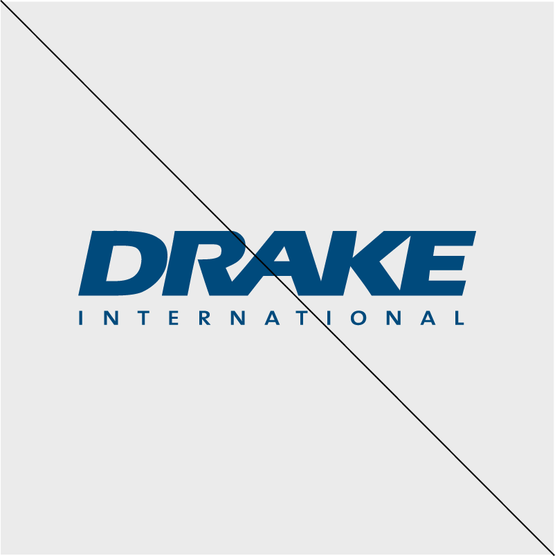
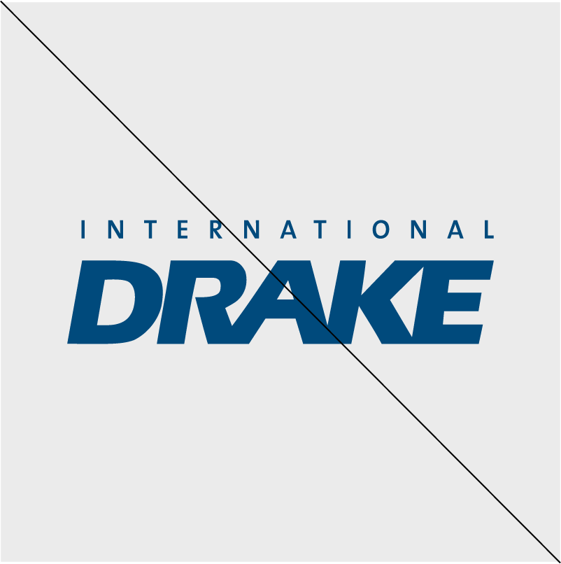
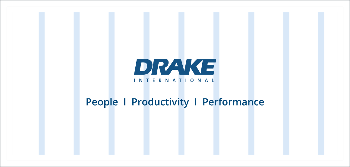
Drake International Logo
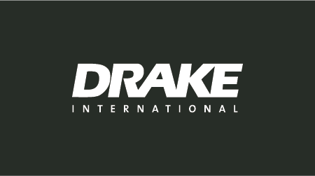
Our logo is composed of 2 words: Drake + International. The word 'Drake' is bold and slanted. The word 'International' is always placed below, and written in a small font.

Logo lockups & colour variations
We use our logo in Drake corporate blue colour, or inverted into white if using on the dark background.


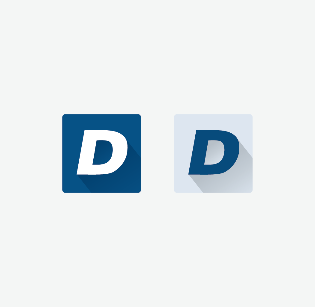
We use Drake icon for representing our Brand in a digital space. For example - favicon.

The word 'international' should be eliminated where space may render the word too small to read. Examples are: promo items.

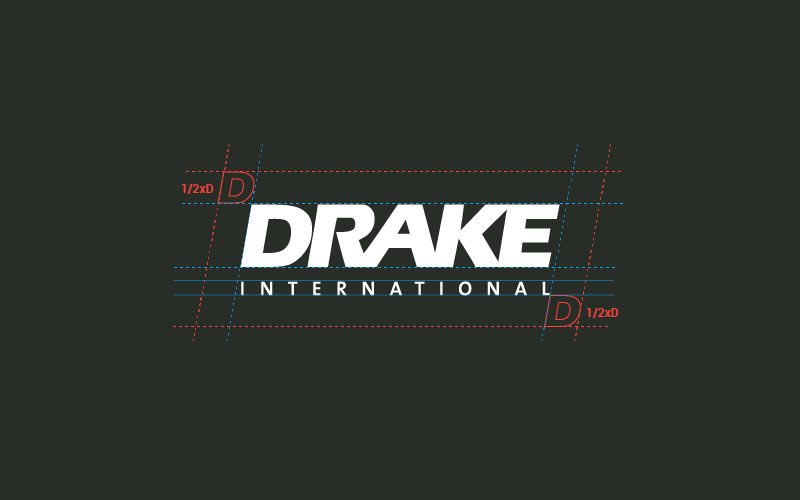
We have specific rules on sizing and placement of the Drake International logo and letter 'D' that we use as a symbol in some cases. To ensure our logo recognition, empty space surrounding the logo is compulsory. We used the D as a measure. For the logo - 1/2xD on every side is the minimum clear area.

Need our logo in high-res?
Logo Guidelines - Don'ts
Logo can't be distorted, rotated. Logo can't be used in the colours that are not included in the brand guide.


Tagline
Our company philosophy is based on the principle that any organization can achieve the highest level of performance and productivity if it is staffed with the right people, utilizing the right skills, knowledge, and behaviours.
This principle has become the base for our tagline ‘People | Productivity | Performance’.
Our tagline is an important element of our brand identity. With this short phrase we communicate our overall brand character, promise, personality and market position.
To develop consistency, and continue to build upon our positioning, the tagline should be used in all visual communication channels - print and digital, no matter what auditory it is targeted to.
Tagline usage
Tagline should be included in the following print materials:
Print materials, newspaper ads*, magazine ads, magazine inserts or flyers, posters/tradeshow banners, brochures, sporting club/sponsorship advertising, promotional items*, internal documents and corporate communication*
Tagline should be included in the following digital assets:
Corporate pages for social media platforms (example: Facebook, LinkedIn, Twitter, etc.), e-mail blasts, social media banners, presentations, animated videos, ads*
*Some exceptions may apply.
Tagline exceptions
The tagline should be eliminated where space may render the tagline too small to read. Some examples are: newspaper ads (if it is smaller than the quarter of the page), promotional items, Google Ads (300 x 250px), etc.

Tagline Style
Tagline font: Open Sans (Semibold).
We will use our approved Drake Blue corporate colour on light backgrounds and reverse it to show a white colour on dark backgrounds; we respect the contrast for better readability.
To ensure legibility, we keep a minimum clear space (1/2xP) around the tagline. This space isolates the tagline from any competing graphic elements.
Tagline Lockups
The tagline can be used in the lockup with the Drake Logo. When placing these lockups, we maintain exclusion zones and avoid distortions.
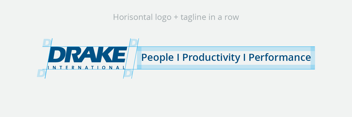


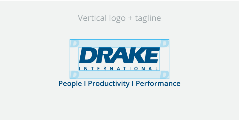
Tagline placement
The tagline and the logo can be used independently from each other.


Tagline examples


Tagline don'ts