
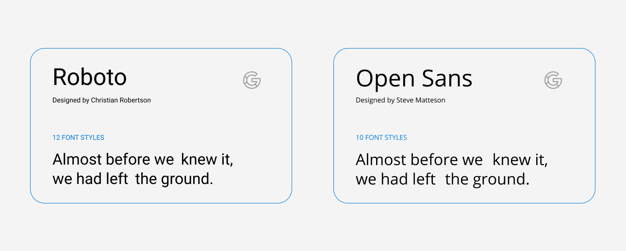
Typefaces
We use 2 typefaces: Roboto and Open Sans. We pair them together to create modern, clear and attractive look.
Roboto has a dual nature. It has a mechanical skeleton and the forms are largely geometric. At the same time, the font features friendly and open curves. Open Sans was designed with an upright stress, open forms and a neutral, yet friendly appearance. It was optimized for print, web, and mobile interfaces, and has excellent legibility characteristics in its letterforms.
Font Pairings
We use Roboto for headlines, introductory paragraphs, quotes, captions and interactive elements like buttons; we use Open Sans for body copy.

Examples
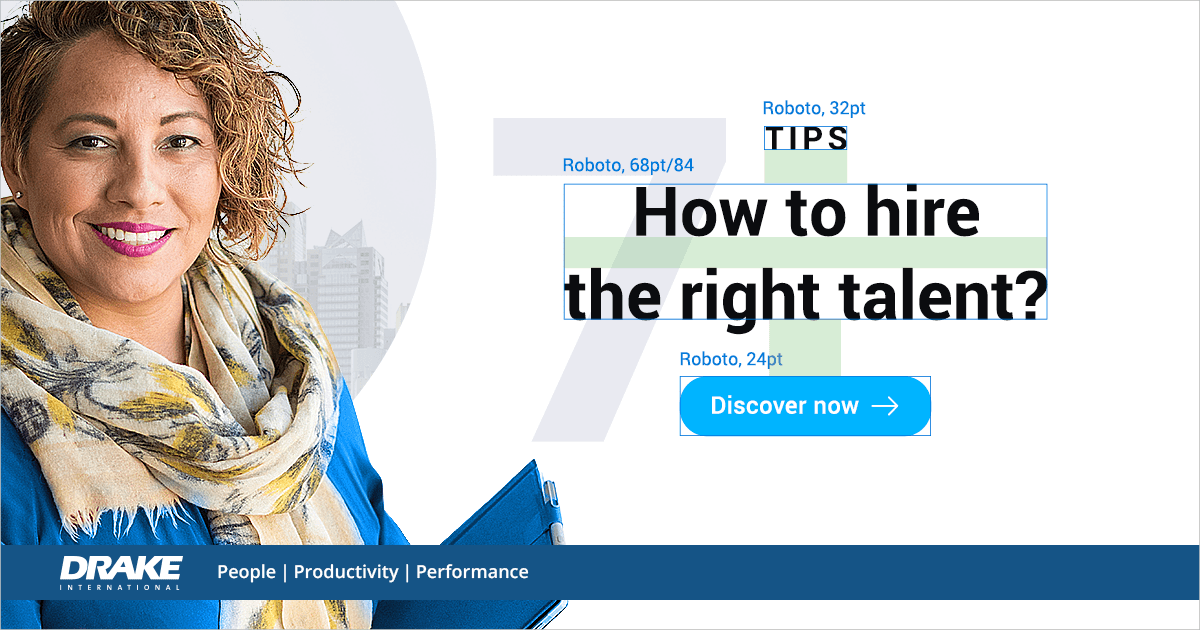


Type Grids
We use multicolumn to provide flexible formats for publications that have a complex hierarchy or that integrate text and illustrations.

Line-height
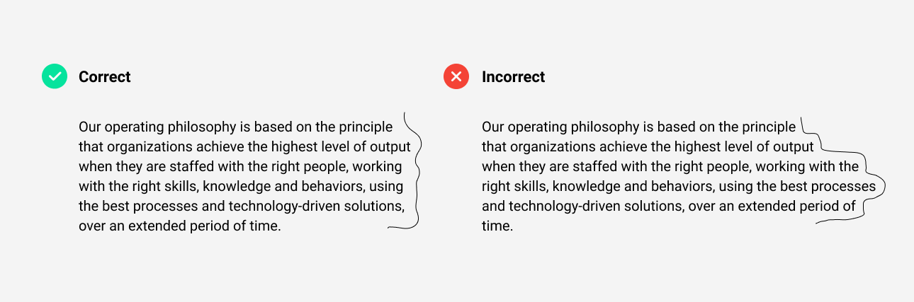
There are two main risks when it comes to line spacing: too little, and too much. Most serious is having too little space between the lines.

Rags, orphans and widows
Always look for opportunities to create improved rags, or ragged edges on the right margin. Watch out for orphans and widows and adjust line lengths with a writer to solve awkward breaks which can affect reading quality.
Type Grid for Web

Buttons and CTA for digital assets
